Dunelm was undertaking a platform migration, with requirements for additional features, new technologies and significant opportunity for UX improvements. Due to an iterative shift from a monolithic data model to in-house microservices, consecutive component based rollouts were required. It would be critical to both maintan a hollistic view and to preserve the live site's integrity when releasing. The agreed method of releasing and monitoring updates allowed for greater freedom and quick quantative perfromance data. There was a dedicated stream for testing, such as design iterations, card sorting and current site user observation.
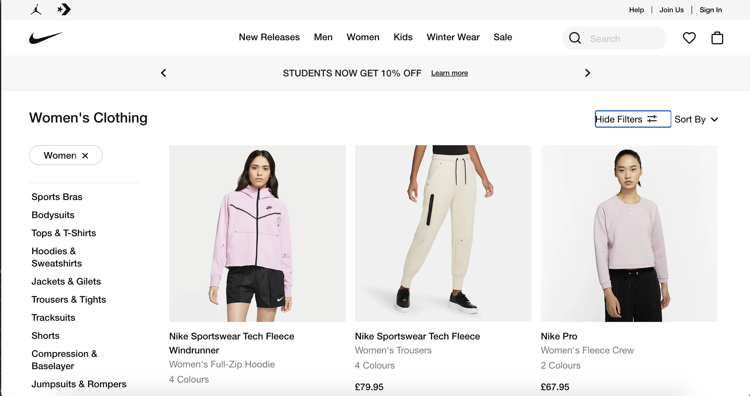
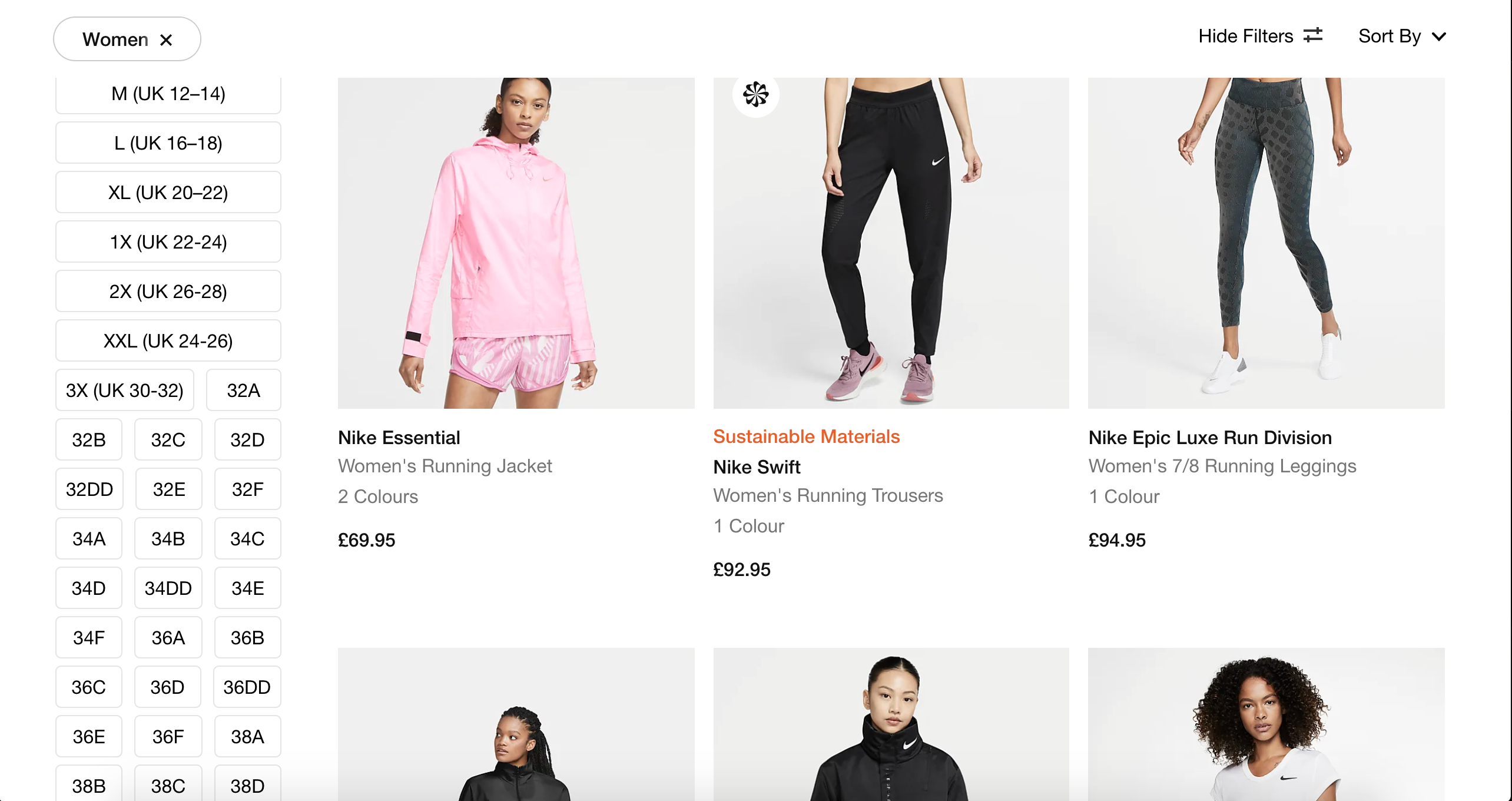
Product List Page
My role at Dunelm throughout it's digital transformation was full cycle. Inititally, I facilitated the stragegic aligment of UX opportunities with business objectives. I then led the rethinking and reworking of the Discover, Inspire, and later the Evaluate vertical of the Dunelm website. This entailed designing for all shoppable pages on the website. Finally, I iteratively released and monitored pages and components to successfully achieve determined UX and business objectives.
Client
DunelmMy role
UX Consultant, 18 monthsProject
Research, User Testing, Problem Reduction, Stakeholder managementProject Background
The Discovery Process
Review of Current Page for painpoints, opportunities and areas of concern.
Lack of spacing around core elements, small text, text lacking in clear a visual heirachy, and inconsistent CTA's and links. The site lacks a visual language to re enforce meaning and enable intutive user behaviour.
Knowns
Unknowns
- 1Interaction with filters very low at 6-8%
- 2Exit rate too high consistently above 50% - home retail avg 40%
- 3CTR & CVR too low
- 1Why aren't users interacting with filters?
- 2Are espots enabling or hindering users?
- 3Are product reviews useful at PLP level?
Hypotheses
- 1If we reduce the amount of content displayed on the PLP then we will increase the CTR and decrease the exit rate because users will not feel overwhelmed by the current PLP offering.
- 2If we focus on filters at all stages of scrolling on the PLP then we will improve CVR as users will be enabled to find and purchase the products they are looking for.
- 3If we create clear and usable Filters then we will improve CVR as users will be enabled to find and purchase the products they are looking for.
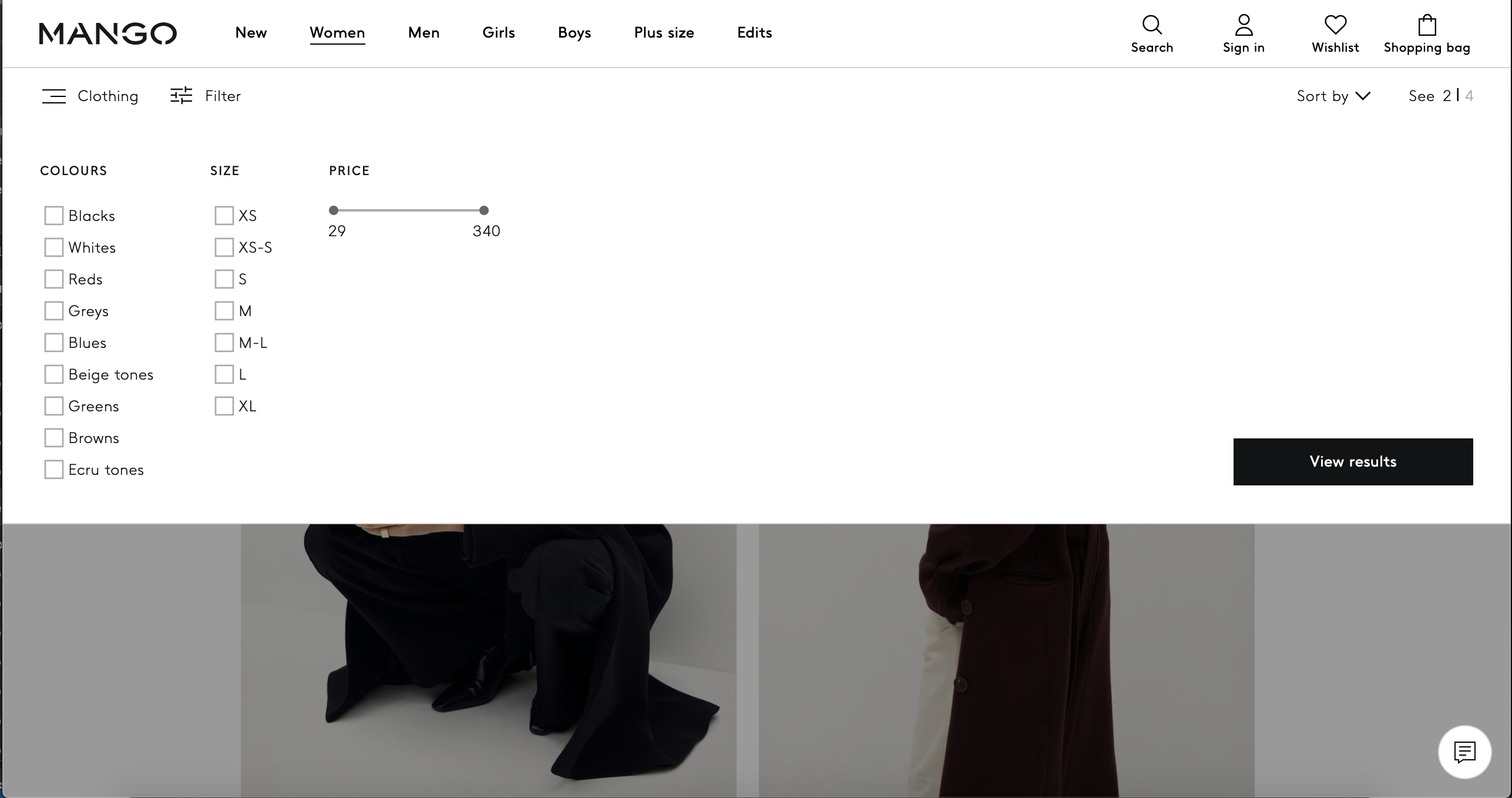
My primary focus was to standardise and prioritise the information displayed.
Only one promotional banner, brand to only be used when not a Dunelm product and migrating the content team away from images with banners embeded and instead supporting real time editing of promotional banners in the CMS.

Consistency in placement help form future user expectations.
Clearly show which filters have been selected by the user
The application of the see more and the fixed scroll within the Filter Set boundary is following UX convention but features an improvement of a commonly applied pattern. Many sites allow the user to scroll directly within the Filter Set boundary.
I was keen to avoid creating any areas on the screen in which the user could accidentally scroll filters as opposed to the product list. Keeping the scroll behind an action prevents confusion, jarring dual scroll and also prevents the user from feeling overwhelmed by many options they have not yet displayed an intent to see.
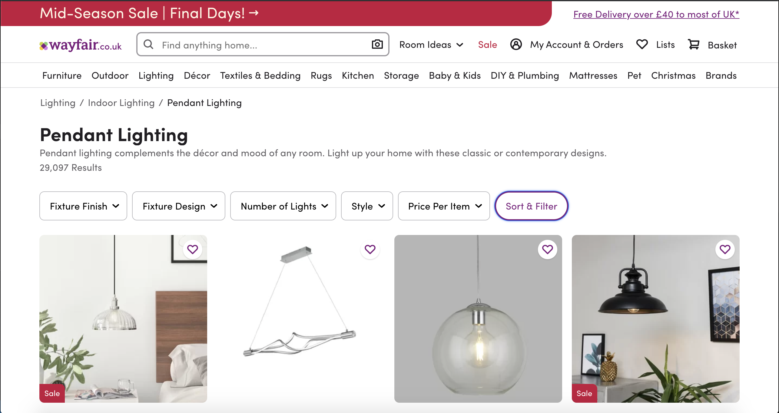
Filter Considerations
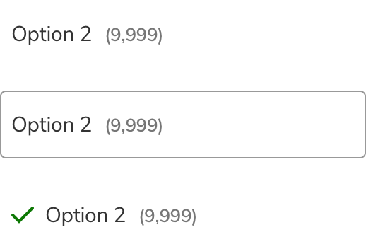
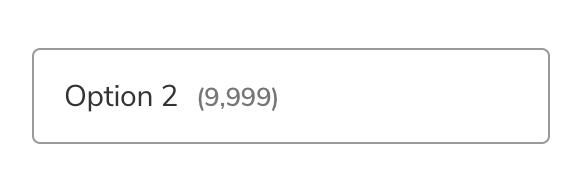
Initial state appears sparse without a border when providing users a 40px target area
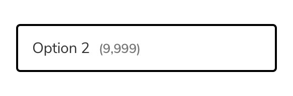
Focus appears more prominent than selected state.
Selected state is not obviously definied on first impression.
Inititial State is a clear target area.
Focus is defined in colour and thickness from Initial State.
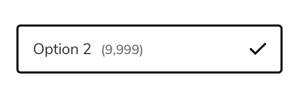
Selected State is defined by 2 traits for increased accessibility. Tick placement is on the right, this enables for consistent text alignment for scanning.
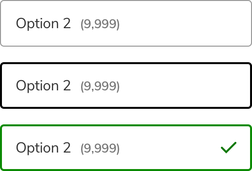
Inititial State is a clear target area and communicates inactive status via conventional visual language.
Focus is defined in colour and thickness from Initial State. Clearly communicates inactive status.
Selected State is defined by 2 traits for increased accessibility. Clearly communicates active status.
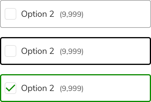
Inititial State is a clear target area.
Focus is clearly defined in colour and fill from Initial State.
Selected State is clearly defined in thickness, colour and fill
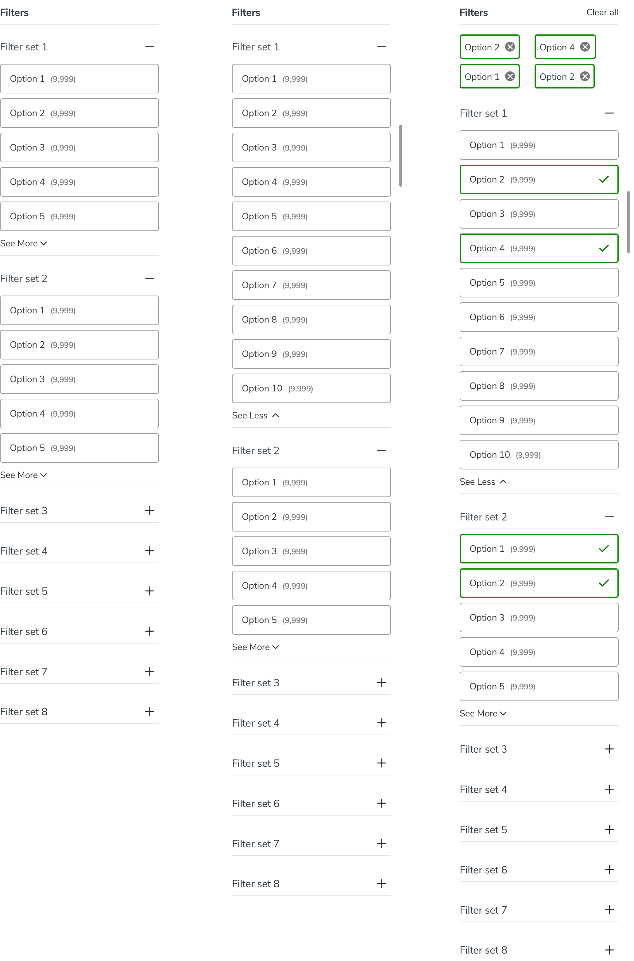
Having developed a series of Filter Option styles and states I needed to consider them as a part of a larger functional structure.
The structure of the Filter Sets is conventional for a retail website. It was optimal to default some filters to expanded states despite the often long lists of Filter Sets. Expanded Filter sets received 16% more usage and users who interact with filters have significantly higher CVR.
User testing provided crucial insight that usability and preference testing did not. The key areas of concern from user observation were;
- 4/10 users did not understand the minus icon in the Filter Set accordions when asked to collapse the Filter Set.
- 3/10 users expressed confusion at the plus icon in the Filter Set accordions with 1/10 believing it would apply all of those filters.
- 4/10 users did not understand the see more active text with 2/10 believing scrolling in that area would expand and 1/10 thinking that the 8px arrow icon was the click zone to expand.
- 2/10 users commented after having selected 2 Filter Options that there was “a lot of green” or that the design was “very green”
- 3/10 users showed hesitation when asked to remove a single applied Filter Option.
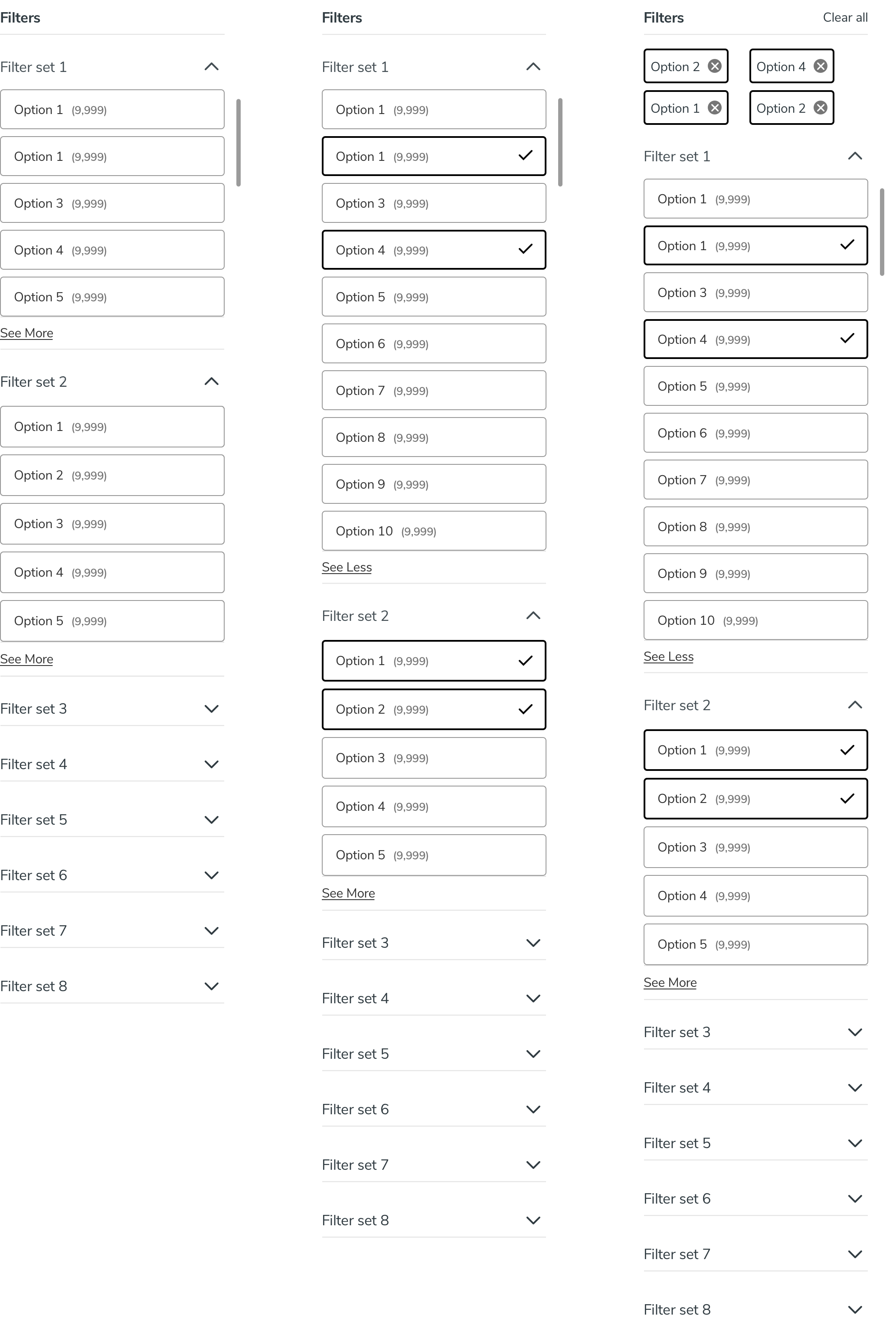
Further rounds of user Testing, A/B Testing via monetate and preference testing influenced additional iterations to the PLP. This design had successfully passed our user observations and was ready to launch to the 25% test audience in preparation for launch. The changes include;
- Accordions updated to arrows from minus / plus icons
- See more links updated to a link style active text from text + icon active text
- Selected Filter Options are now black instead of green
- Slightly darker grey outlines on borders a divider lines
- Icon to delete selected Filters changed to a cross with filled background to be more noticable
Sticky Header
Maintaining a sticky header gives the user a quick return to the menu should they decide this search is not useful. 60% of users bounce after page 2 so this is an essential anchor to place them back at the top of the conversion funnel.
The website attracted increased user visits, 37.5m per year, Annual revenue increased 4.8% to £1.1bn, with pre-tax profits up by 23.4%.
Conversion rates were up significantly, with Add to basket increasing 23%. Online sales were up 130% from the previous year, taking them to 31% of total sales across the business.
Review
It was a hard requirement that the new platform was launched with adequate time for testing, before the peak period in order to allow for a go or no go review. A high risk requirement was that the transition did not disrupt this high value trading period.
Dunelm reinvested in its digital offering and saw signifcant ROI. In 2020 many highstreet retailers made signifcant losses: Dunelm outperformed the retail market due to its new digital capabilities with an increase of online 85.2% in Q2 and 60% year end in online sales 2020 on 2019.